Common Room — a Toronto cannabis dispensary that treats every visit as a relationship.
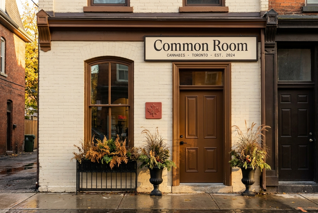
A single Queen West storefront. Tightly curated Canadian craft selection. A leather chair near the front for the regulars. This showcase walks through the strategy, identity, retail system, and member experience shipped by Roamad Creative.
01 · The strategy in one paragraph
The Toronto category has collapsed into commodity. The premium-curated-retail buyer has nowhere to go.
Toronto’s cannabis retail landscape is dominated by discount independents and pharmacy-aesthetic chain stores. Meanwhile the city has a large premium-curated-retail buyer base that already values their wine merchant, their bookstore, and their butcher as part of a weekly rhythm. Common Room is built for that buyer. The shop is single-location, deliberately small, deliberately hospitality-led. The buying experience is the product.
Positioning
For the Toronto cannabis buyer who treats their wine merchant or their bookstore as part of their week, Common Room is the dispensary that treats every visit as a relationship — tightly curated selection of Canadian craft cultivators, knowledgeable staff, and the patience to let the buyer browse.
02 · Palette
Five values. One earned accent.
Oat cream substrate — the color of a well-worn university common room. Deep ink for type. Maple brown for the architectural elements (counter, shelves, sign trim, region dividers) — a quiet Canadian heritage cue without resorting to the maple leaf as a literal graphic. Soft red is reserved for the wordmark dot, member card, and current-pick callouts. Used anywhere else, red breaks the system.
Color use rule: soft red appears only on the wordmark dot, member card, current-pick shelf-talkers, and gift packaging seal. It must never appear as a sale-tag color, a button color, or a general accent.
03 · Typography system
Three voices. One conversation.
Cormorant Garamond · Display · 400 / 400 italic / 500
A curator, not a cashier.
Inter · Body · 300 / 400 / 500
Common Room is a single-location cannabis dispensary on Queen Street West in Toronto. We carry a tightly curated selection of Canadian craft cultivators, with knowledgeable staff trained to take the time you want. The shop is a room, not a counter.
JetBrains Mono · Data · 400 / 500
TILDEN MTN. FARM · BOUNDARY OG · LOT 26-A07 · CARA’S PICK
04 · Wordmark
The two words, set in italic.
The wordmark is the shop name set in Cormorant Garamond italic lowercase, tracking-tight. A small soft-red dot follows the word on hospitality artifacts (member cards, carry bags, gift packaging) — the visual shorthand for “you’re in.” On utility surfaces (shelf labels, signage above the door, regulatory copy), the dot is omitted; the wordmark stands alone.
05 · Retail system
Four artifacts. One grammar.
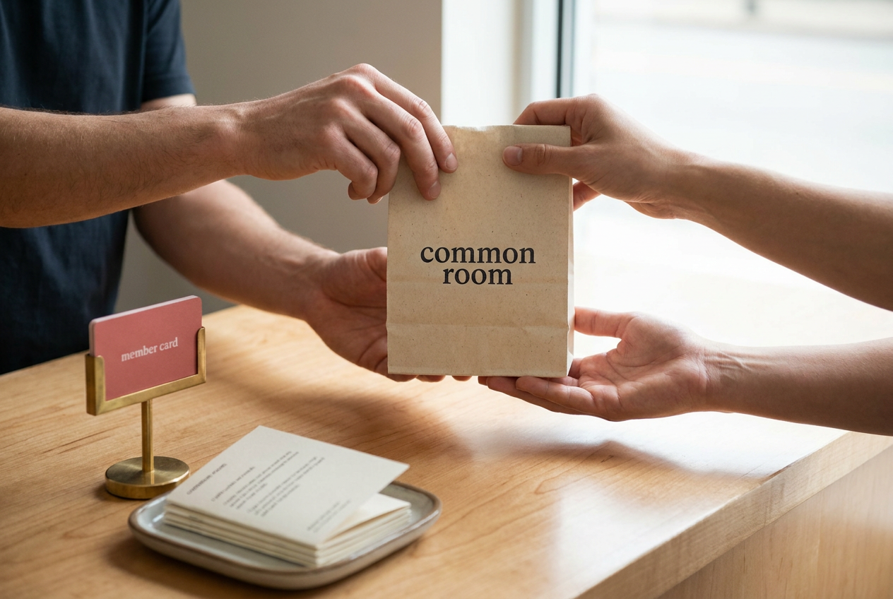
The shop ships every visit with a coherent set of printed artifacts — carry bag, shelf-talker, member card, gift packaging. All four are set in the same grammar: oat-cream cotton stock, wordmark in deep ink, soft-red accent dot, no glossy varnish. Letterpress on the member card. Hand-tied cotton string on the gift packaging.
Oat cream cotton · rope handle
Per-SKU · staff-written
Letterpress · numbered
Cotton-tied · printed insert
06 · The shelf-talker
The artifact that does the real selling.
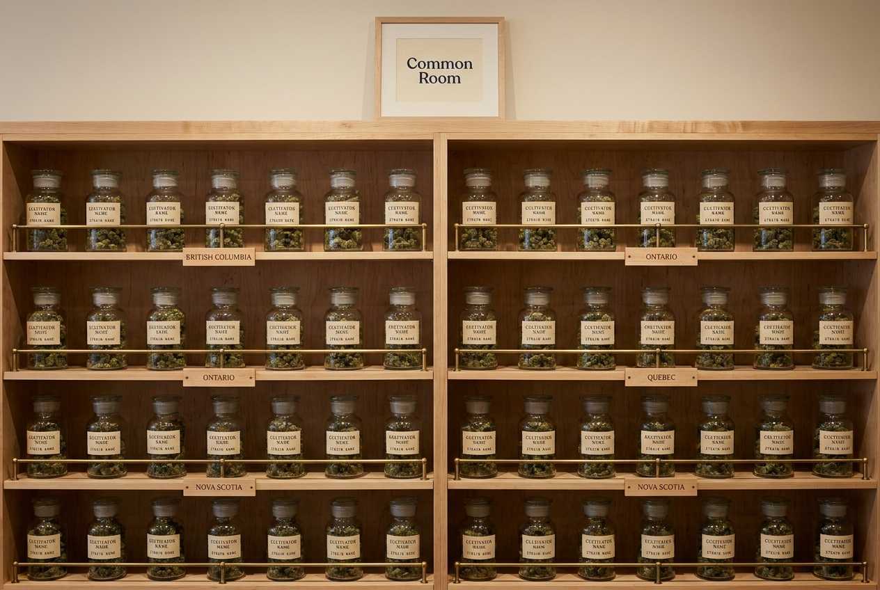
Each of the ~90 SKUs on the wall carries a single oat-cream shelf-talker, staff-written. The talker names the cultivator, the strain, the cure window, two tasting-note adjectives, and the staff member who picked it that week. The card carries no marketing language and no price-tag urgency. It reads like a wine-merchant’s shelf-pick — quiet, specific, signed.
What it carries
Cultivator name, strain name, region (BC / Ontario / Quebec / Nova Scotia), cure window, two-adjective effect profile, staff picker initial.
What it doesn’t
No THC percentage as headline. No fire emojis. No “Limited Stock” sticker. No price-per-gram comparisons. Price appears once, in small monospace, at the bottom right.
Rotation
Shelf-talkers are rewritten weekly. Staff initial the bottom of each card. The act of writing the card is part of the staff member’s shift.
07 · Voice in practice
How the room speaks.
| Surface | Common Room | Not Common Room |
|---|---|---|
| Website hero | A cannabis room on Queen Street West. Canadian craft cultivators, knowledgeable staff, and a chair near the front for the regulars. | Toronto’s premier cannabis dispensary — lowest prices in the city. |
| Shelf-talker | Boundary OG, from Tilden Mountain Farm in southern BC. Cured 21 days. Heavier evening profile. Cara’s pick this week. | Boundary OG — 31% THC FIRE — limited stock. |
| Member email | The Q2 limited-release from Whistler Cannabis lands Thursday. Two pre-orders per member. | EXCLUSIVE DROP — MEMBERS ONLY — click now. |
| In-store sign | Take a seat near the window. We’ll come to you. | Please wait to be served. Cash only at this register. |
08 · The consultation
The 15-minute conversation that turns first-timers into regulars.
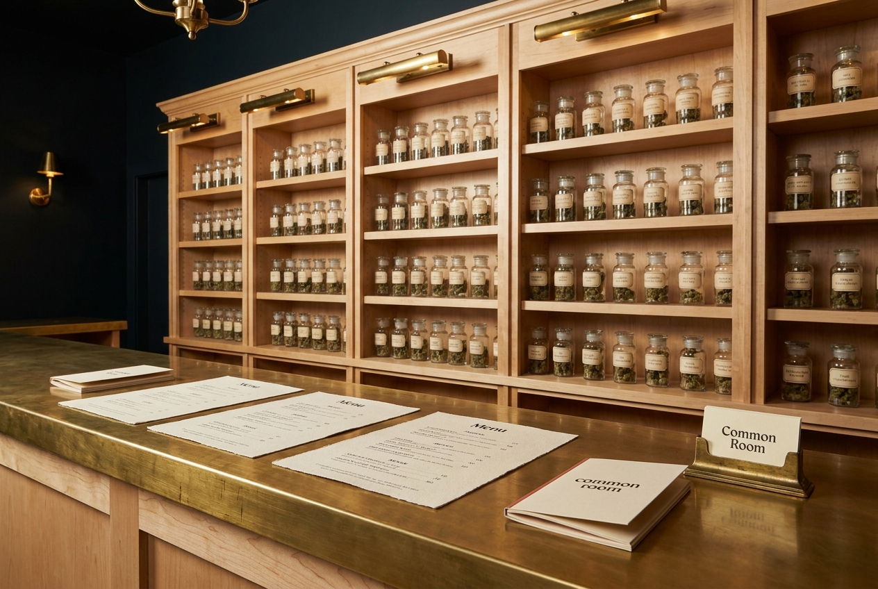
Every new visitor is offered a structured 15–25 minute consultation at the counter. The conversation follows a quiet five-question rhythm: history with cannabis, current interest, sensitivities, budget, and the next twelve hours of plans. The staff member uses what they hear to walk the buyer to three SKUs on the wall — never more, often two. The buyer leaves with a curated kit, a printed staff-pick card with the picker’s initial, and (if they engaged in the consultation in good faith) an offer of the member-card on their second visit.
09 · The member’s lounge
A small room at the back, not for sale.
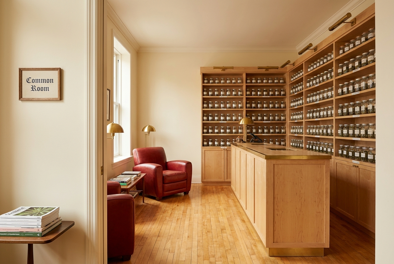
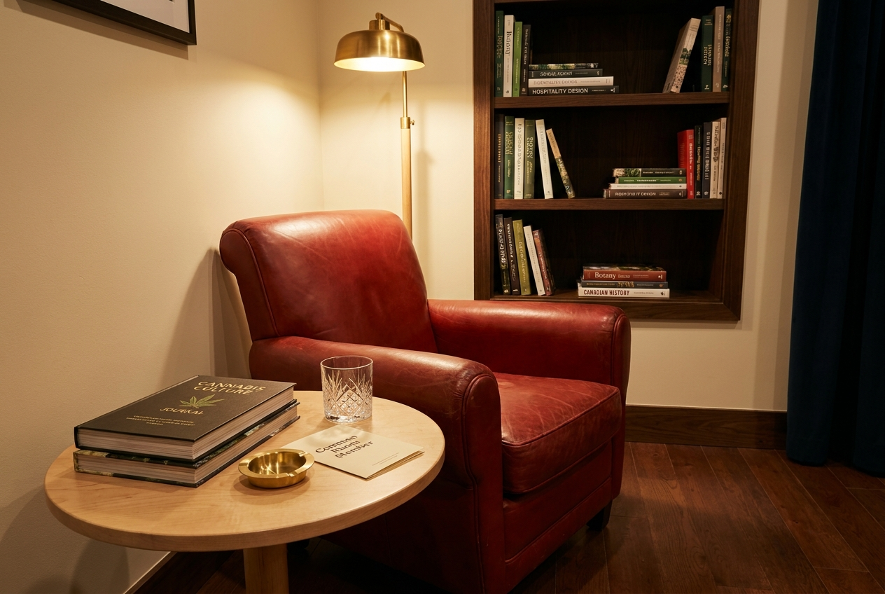
The back-corner lounge holds a single soft-red leather club armchair, a small maple side table, and a built-in bookshelf with curated publications on cannabis, hospitality, and Canadian culture. Members may use the space during open hours. No purchase is required to sit in the chair. Nothing in the lounge is sold. The space exists explicitly to make the brand’s positioning real on a Tuesday afternoon: a room, not a counter.
10 · Guideline summary
The rules, on one page.
Always
- Set the wordmark in Cormorant Garamond italic lowercase
- Use oat cream as the print substrate
- Reserve soft red for the wordmark dot, member card, and current-pick
- Source from Canadian-grown craft cultivators only
- Sign every shelf-talker with the picker’s initial
- Greet every guest within ten seconds of entry
- Offer the chair before offering a product
Never
- Use cannabis-leaf or literal-maple-leaf imagery
- Use fluorescent or backlit signage
- Discount, run promotions, or display sale stickers
- Use words like “exclusive,” “premier,” or “fire”
- Lead with THC percentage on the shelf-talker
- Use exclamation marks
- Set transaction-time targets on the staff
Closing
Common Room is the dispensary the regular sends a friend to on the way over to dinner. The system above is what makes that recommendation easy to give.