Counter — the cannabis dispensary chain built like a flagship retail product.
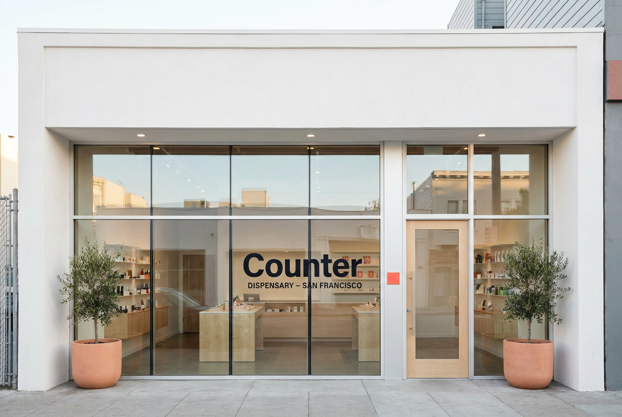
A four-location San Francisco cannabis retailer modeled on Apple, Mejuri, and Aesop. White-walled. Light-maple-tabled. Vertical private-label. iPad checkout. This showcase walks through the strategy, identity, packaging, and retail system shipped by Roamad Creative.
01 · The strategy in one paragraph
SF cannabis retail is fifteen years behind the rest of premium retail. Counter closes the gap.
Walk into a typical California dispensary in 2026 and the room looks like 2008 with state stickers. Glass cases behind the counter. Cash-wrap register. Patchwork third-party packaging. Counter ports the modern flagship-retail playbook directly: floor-to-ceiling glass, white walls, light maple tables, products on the table like Apple devices, iPad checkout brought to the buyer, every SKU private-labeled in Counter packaging. The founders ran Apple Retail and Mejuri merchandising. The format is replicable across four SF locations.
Positioning
For the San Francisco buyer who is tired of cannabis retail looking nothing like the rest of the city, Counter is the dispensary chain built on the modern flagship-retail playbook — private-label product, white-and-maple stores, mobile checkout, and packaging you’d be happy to leave on the kitchen counter.
02 · Palette
Three values. One signature.
Clean white substrate everywhere. Deep ink for type. Electric coral as the only saturated color in the system — reserved for the wordmark rule, current-Edition callouts, app CTA buttons, and the ceramic plaque at the door of every location. Coral is the brand’s recognition signal. Used anywhere else, it breaks the system.
Color use rule: electric coral appears only as the horizontal rule below the wordmark, as Edition-callout fills, as app CTA fills, and as the door-frame ceramic plaque at each location. Anywhere else, coral is forbidden.
03 · Typography system
Three weights. One geometric family.
Manrope · Display · 700 / 800
Cannabis retail, caught up.
Inter · Body · 300 / 400 / 500
Counter is a four-location San Francisco dispensary chain. Every product on the shelf is a Counter Edition — sourced from licensed California cultivators, re-packed in Counter packaging. The store is the product as much as the cannabis is.
JetBrains Mono · Data · 400 / 500
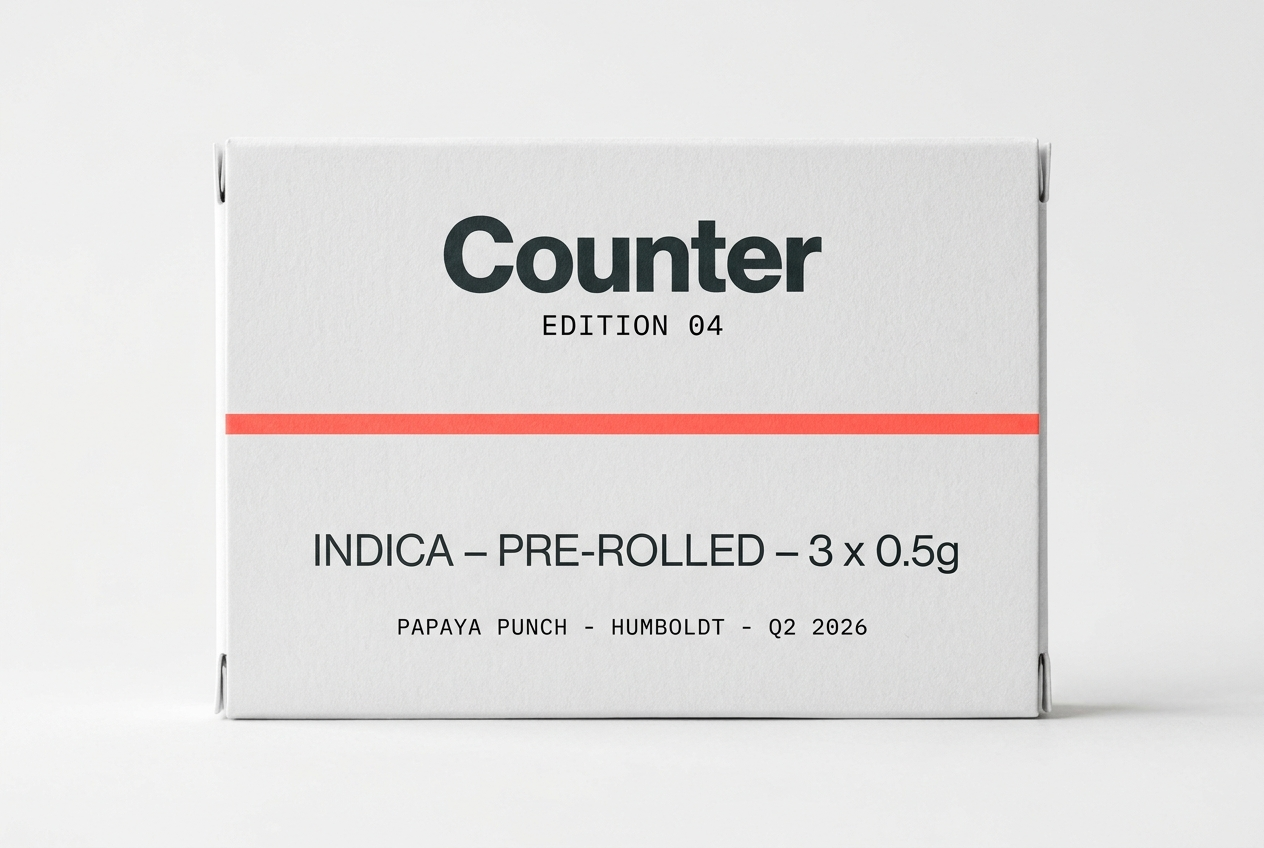
EDITION 04 · INDICA · PAPAYA PUNCH · HUMBOLDT · Q2 2026
04 · Wordmark
The word, underscored in coral.
The wordmark is the brand name set in Manrope Extrabold lowercase, tracking-tight, with a single thick electric-coral horizontal rule beneath. The rule is the persistent visual signature — it appears under every wordmark on every artifact (storefront glass, packaging box, app splash screen, business card). The full lockup is counter dispensary, with "dispensary" set in monospace caps below. The standalone mark is just counter.
05 · Packaging system
Four formats. One construction.
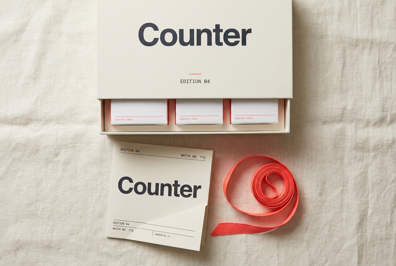
Every Counter product ships in the same packaging system: rigid white matte cardboard, Apple-product-style construction, electric coral accent rule below the wordmark, single product category in large display sans, monospace strain identifier at the bottom. No glossy varnish. No images of the product on the box. The unboxing is the brand.
3.5g / 7g rigid box
3-pack 0.5g
1g live rosin in jar
All four formats · quarterly
06 · The display table
The Genius-Bar of cannabis retail.
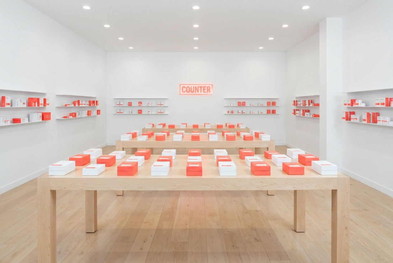
The defining architectural element of every Counter location is the maple display table — three per store, arranged in a row down the center of the floor. Each table holds the current Edition’s SKUs laid flat at perfect spacing, exactly the way Apple lays out iPhones on a Genius Bar. The buyer walks up to the table, picks the box up, reads the side panels, asks a question. There is no glass case to ask a budtender to unlock. The product is in your hand within ten seconds of walking in the door.
Why the table
The table eliminates the budtender-as-gatekeeper retail dynamic. The buyer interacts with the product first, the staff second. The conversation that happens at the table is curiosity-led, not access-led.
The grid spacing
Boxes are spaced exactly 8 inches apart. The empty space around each product is the design. The grid reads as confident and museum-quality at first glance.
Rotation rhythm
Tables are reset every Monday morning. The current Edition occupies the front-most table. Prior-Edition rotations occupy the middle and back. Staff walk a fresh customer through table-by-table.
07 · Voice in practice
How the brand speaks.
| Surface | Counter | Not Counter |
|---|---|---|
| Website hero | Cannabis retail, caught up. Four locations in San Francisco. | San Francisco’s premier premium cannabis dispensary. |
| Product page | Counter Edition 04. Indica. Three half-gram pre-rolls. Papaya Punch from Humboldt. $42. | FIRE indoor exotic Papaya Punch — limited drop. |
| Edition release | Counter Edition 07 lands Thursday. Two SKUs added, one rotated out. Reservation in the app. | Don’t miss our most innovative release ever. |
| App notification | Your order is ready. Pickup at SoMa. | Hey! Your stash is ready! Don’t leave it waiting. |
08 · Mobile checkout
No cash wrap. Apple Pay default.
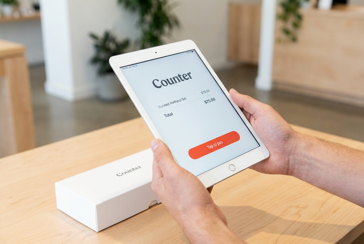
Counter eliminates the cash-wrap counter entirely. The buyer hands their selection to a staff member at the table, the staff scans the package via iPad, the buyer taps Apple Pay, the receipt arrives by SMS. The whole transaction takes 90 seconds at the median. Cash is accepted but discouraged. There is no register, no receipt printer, no line.
09 · The shelf wall
The product family at a glance.
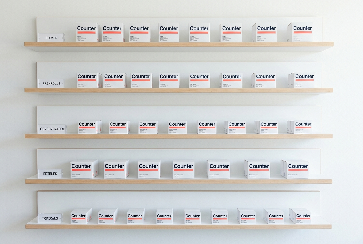
The shelf wall behind the display tables holds the full current selection — product boxes arranged in a museum-style grid by category (Flower / Pre-Rolls / Concentrates / Edibles / Topicals). Because every box is Counter-packaged, the wall reads as a coherent brand catalog from across the room. This is the visual moment that does the heaviest brand work: a buyer walking past the storefront sees a unified product family through the glass and recognizes Counter as a designed object, not a patchwork.
10 · Guideline summary
The rules, on one page.
Always
- Set the wordmark in Manrope Extrabold lowercase with coral rule beneath
- Use clean white #FAFAFA as the primary surface
- Reserve coral for the wordmark rule, Edition callouts, app CTAs, door plaque
- Use ISO date format and monospace Edition numbers
- Number every Edition release sequentially (01, 02, 03…)
- Default to Apple Pay; deliver receipts by SMS
- Keep the floor walkable: no checkout line, ever
Never
- Use cannabis-leaf, smoke, or fire imagery
- Build a cash-wrap counter
- Use glass display cases behind the counter
- Sell third-party brand packaging on the shelves
- Use the words “drop,” “exotic,” “fire,” or “premier”
- Use exclamation marks
- Run discounts, sales, or promotional pricing
Closing
Counter is what Apple Retail would build if Apple Retail sold cannabis. The store is the product. The system above is what makes that promise legible from the sidewalk.