A worked example of the Old-School Cultivator direction — what Roamad ships when a client has fifty years of cannabis credibility and needs the brand to finally catch up. The fictional brand is Halfmoon, a heritage cannabis farm on the Mendocino coast since 1976.
Halfmoon is a heritage California cannabis farm operated by three generations of the Hadley family on the Mendocino coast since 1976. The brand that doesn’t pretend cannabis was invented in 2012.
Bevan heritage serif, cream paper, dusty-terracotta accent, four harvest swaps a year, three faces, no green, no pastiche.
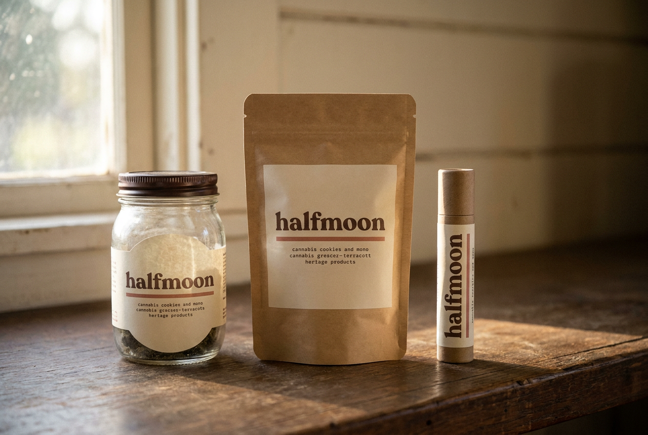
Halfmoon is a typographic brand set in Bevan Regular — the open-source Google Fonts equivalent of Cooper Black, the heavy-stroke heritage serif that anchored every 1970s California heritage brand worth studying. No symbol mark in v1. The wordmark carries the brand alone, which is the right posture for a brand whose whole point is conviction.
Three colors in hierarchy: cream paper, faded chocolate, dusty terracotta. Four harvest accents (spring, summer, fall, winter) rotate the terracotta on harvest-specific materials. No green — the absence is structural to the heritage signal. Cannabis brands that lean on green broadcast their category before they broadcast their brand. Halfmoon doesn’t.
Bevan carries the heritage voice (wordmark, headlines, product names). Inter handles every paragraph of body and UI. Courier Prime is reserved for typewritten metadata — batch codes, cure dates, dose lines, farmstand signage. Fraunces Italic appears as a paired contrast face for italic emphasis only.
The voice of a 65-year-old grower who has seen this market arrive late and is amused, not offended, that anyone wants to buy what they’ve been making the whole time. Plain. Weathered. Adult. Never nostalgic.
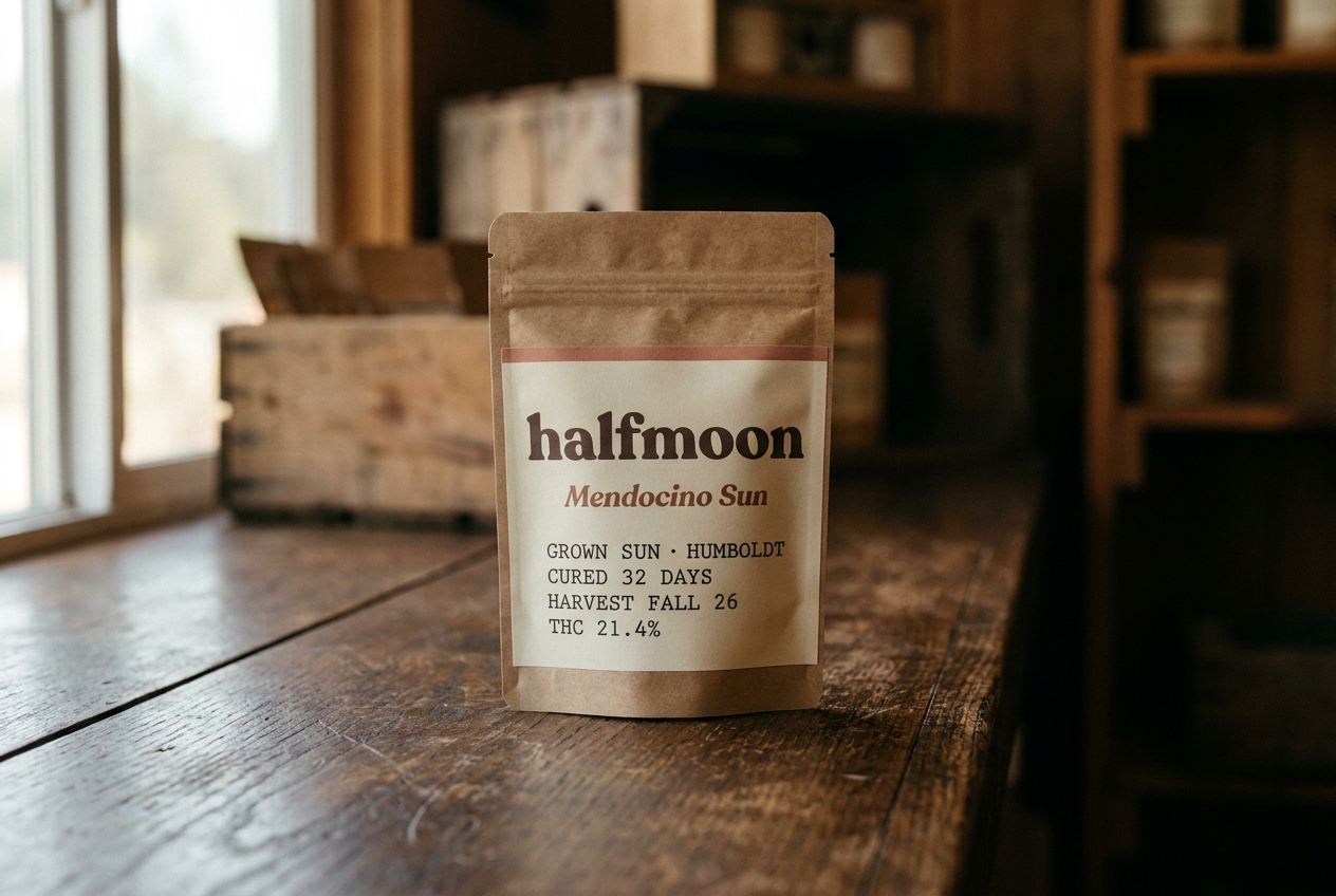
“Mendocino Sun. Fall 2026. Sun-grown, hand-trimmed, cured 32 days. Indica-leaning. Reads as cold air and split wood.”
“The fall harvest finished last Saturday. About 720 pounds came in. Margaret and Jesse have it all hung now. The first jars open around Thanksgiving.”
“Cash and cards. Closed Sunday and Monday. Ask the floor for the current shelf.”
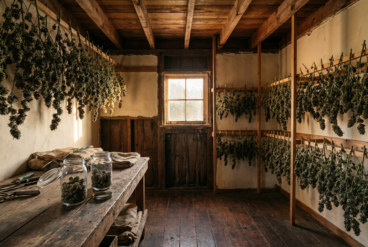
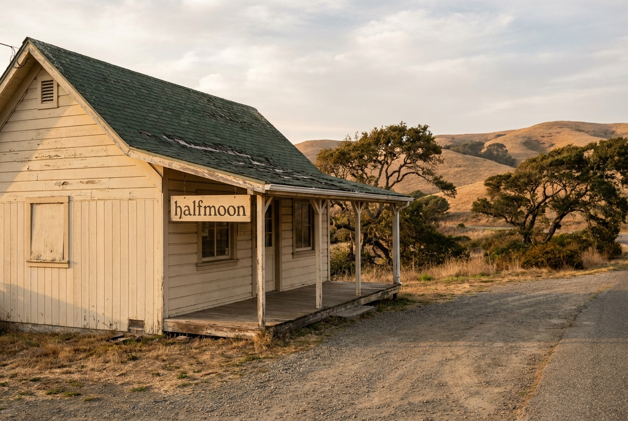
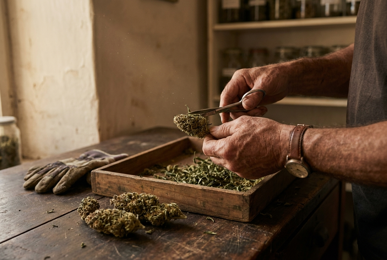
Photographed in the cure room and at the farmstand counter. Available-light, place-specific, no studio strobe. Every shot is the brand applied to the actual surface it ships on.
The brand lives in two physical surfaces: the cure room on the back ridge of the farm and the farmstand at the gravel pull-off on Highway 1. Both shot in late afternoon. Both reshot quarterly to match the harvest accent rotation.
The single most repeated framing across the brand’s lifetime. Faces never in frame. Hands trimming, hands jarring, hands labeling. Reshot every harvest. Different Hadley each quarter — Earl in fall, Margaret in winter, Jesse in spring, all three at summer.
Halfmoon ships small. Six SKUs in the fall 2026 line. Each one numbered by the harvest, dated by the cure, sold until it’s gone. No restock. The next harvest brings the next line.
| Index | Product | Substrate | Spec |
|---|---|---|---|
| F.01 | Flower bag | Kraft mylar | 3.5g · Mendocino Sun |
| F.02 | Flower bag | Kraft mylar | 3.5g · Boundary OG |
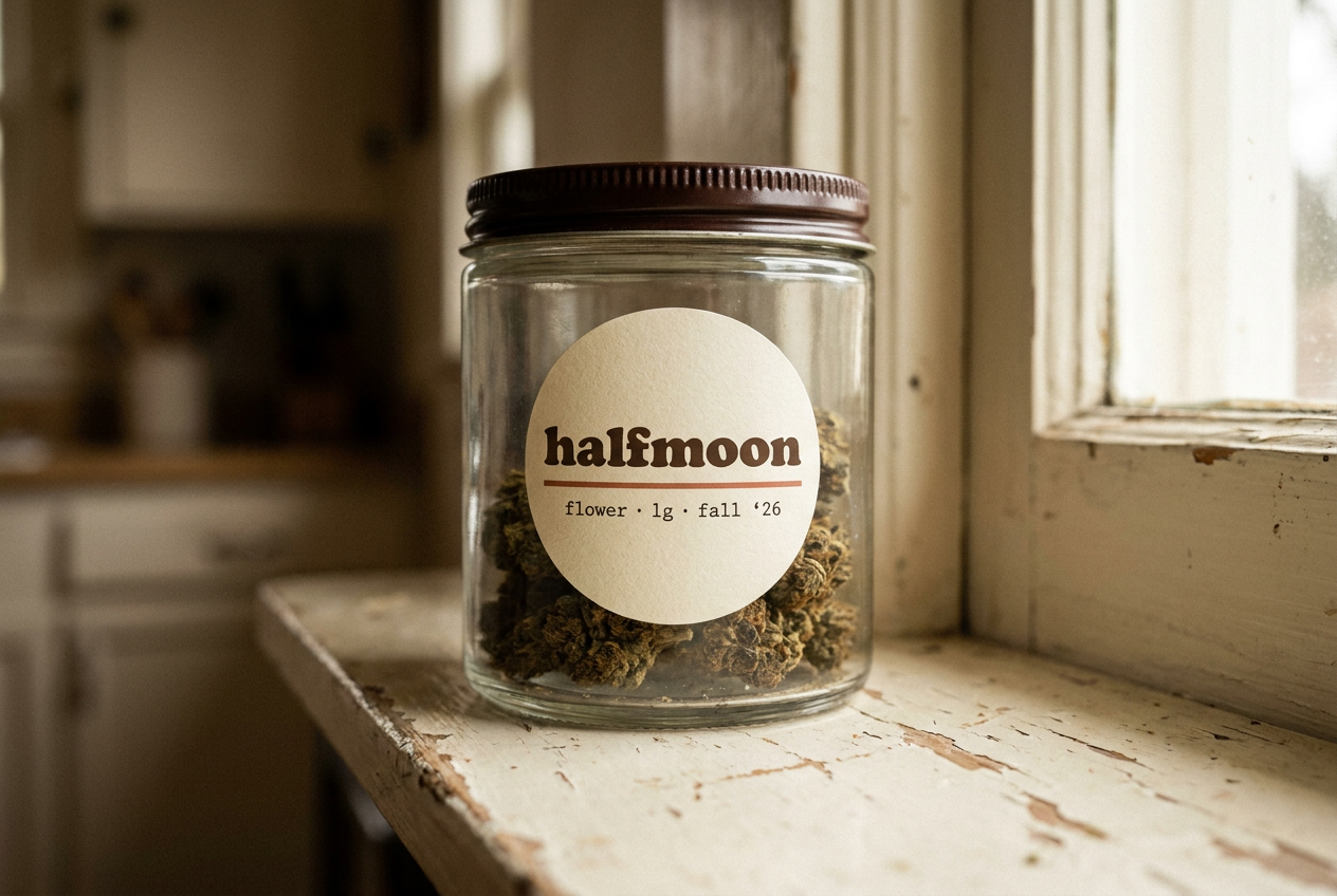
| F.03 | Flower jar | Vintage glass | 1g · Boundary OG |
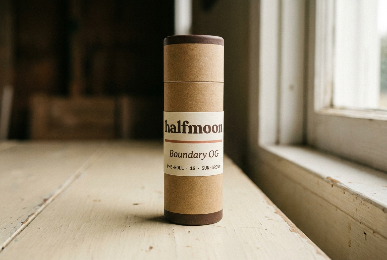
| F.04 | Pre-roll, single | Kraft tube | 1g · hand-rolled · Boundary OG |
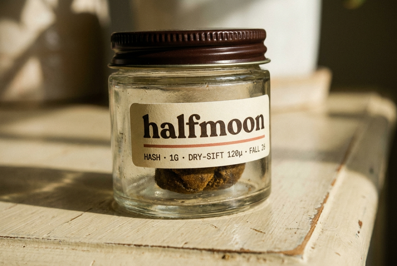
| F.05 | Hash | Vintage glass | 1g · dry-sift 120μ |
| F.06 | Hash | Vintage glass | 1g · ice-water |