Proof — documented cannabis from Bend, Oregon.
A premium cultivator brand built around laboratory grammar. Every batch tested twice. Every claim verifiable. This showcase walks through the strategy, identity, packaging, and retail system shipped by Roamad Creative.
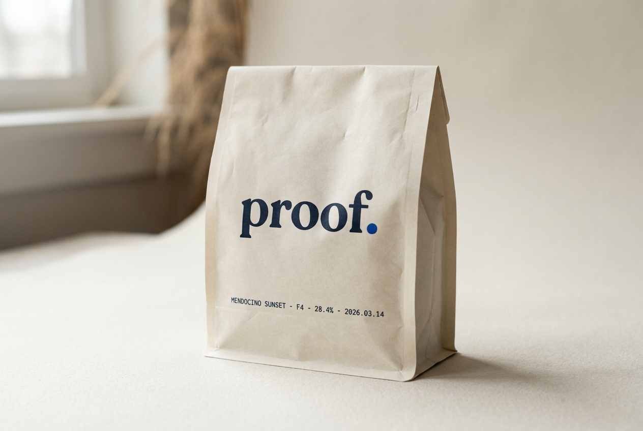
01 · The strategy in one paragraph
The category sells vibes. The buyer reads labels.
Proof exists for the cannabis buyer who reads back panels. The brand borrows its vocabulary from chemistry monographs, specialty coffee cupping notes, and well-written nutrition labels — never from dispensary marketing. The deliverable: a brand that looks at home next to Aesop on a bathroom shelf and next to a wine vintage on a sommelier’s reference card.
Positioning
For the cannabis buyer who reads labels, Proof is the craft cultivator that documents every batch the way a wine maker documents a vintage — precisely, transparently, and without theatre.
02 · Palette
Five values. One accent.
Proof is built on a single substrate (warm-white #F4EFE6) and a single ink (deep navy #1A2638). The cobalt accent appears only in verified-claim badges and lab-result callouts. Used sparingly, it signals data integrity at a distance.
Color use rule: cobalt covers no more than 4% of any printed surface and is reserved for verification marks, test-result callouts, and QR registration dots.
03 · Typography system
Three voices. One conversation.
DM Serif Display · Display · 400 / 400 italic
Documented cannabis. Tested twice.
Inter · Body · 300 / 400 / 500
Proof grows craft cannabis in Bend, Oregon. Every batch is tested by two third-party labs and the full panel is published on each package. The brand voice is calm, precise, and declarative — the voice of a chemist who happens to know cannabis.
JetBrains Mono · Data · 400 / 500
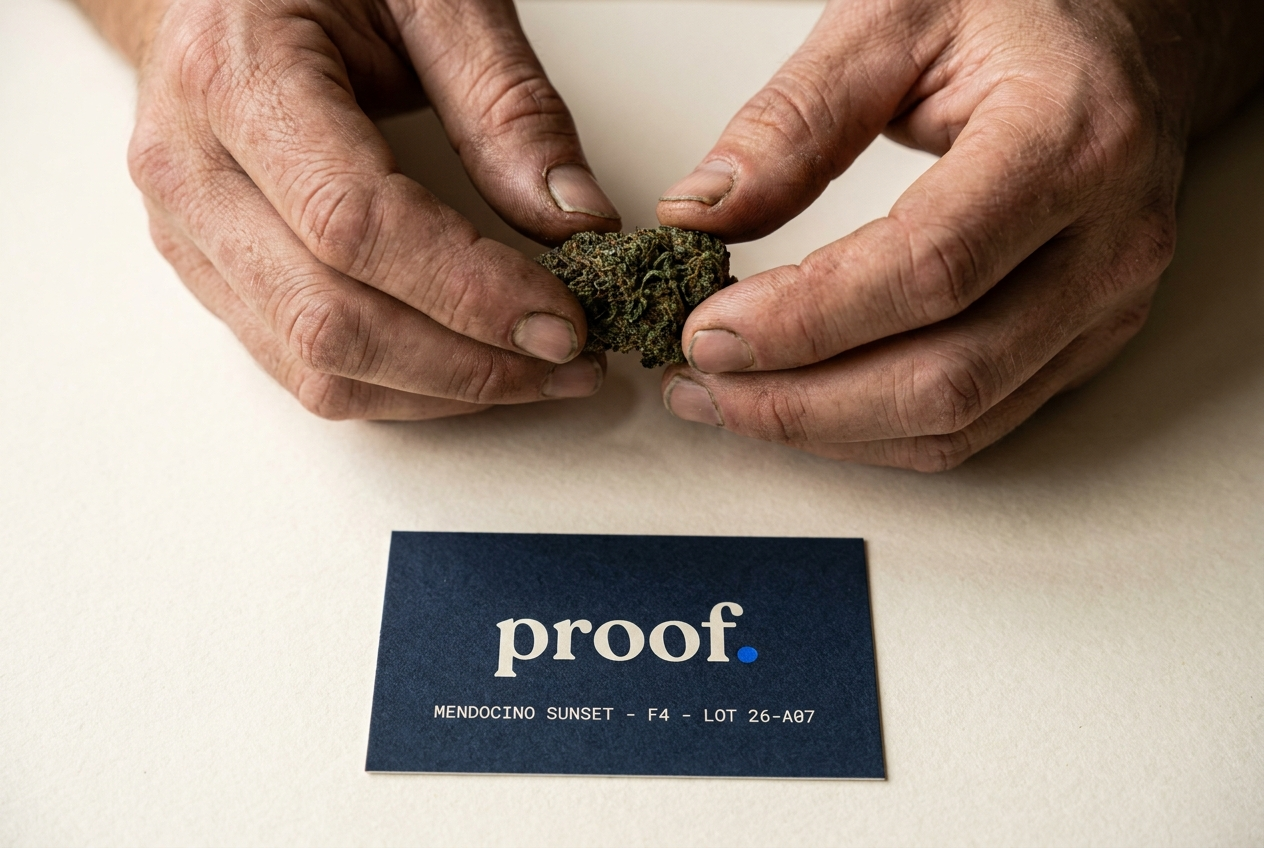
MENDOCINO SUNSET · F4 · THCa 28.42% · LOT 26-A07 · 2026.03.14
04 · Wordmark
The word, set tight.
The wordmark is the brand name set in DM Serif Display lowercase, tracking-tight. A single cobalt dot follows the word as a verification mark — the visual shorthand for “tested.” The dot is optional in long-form use and required on packaging.
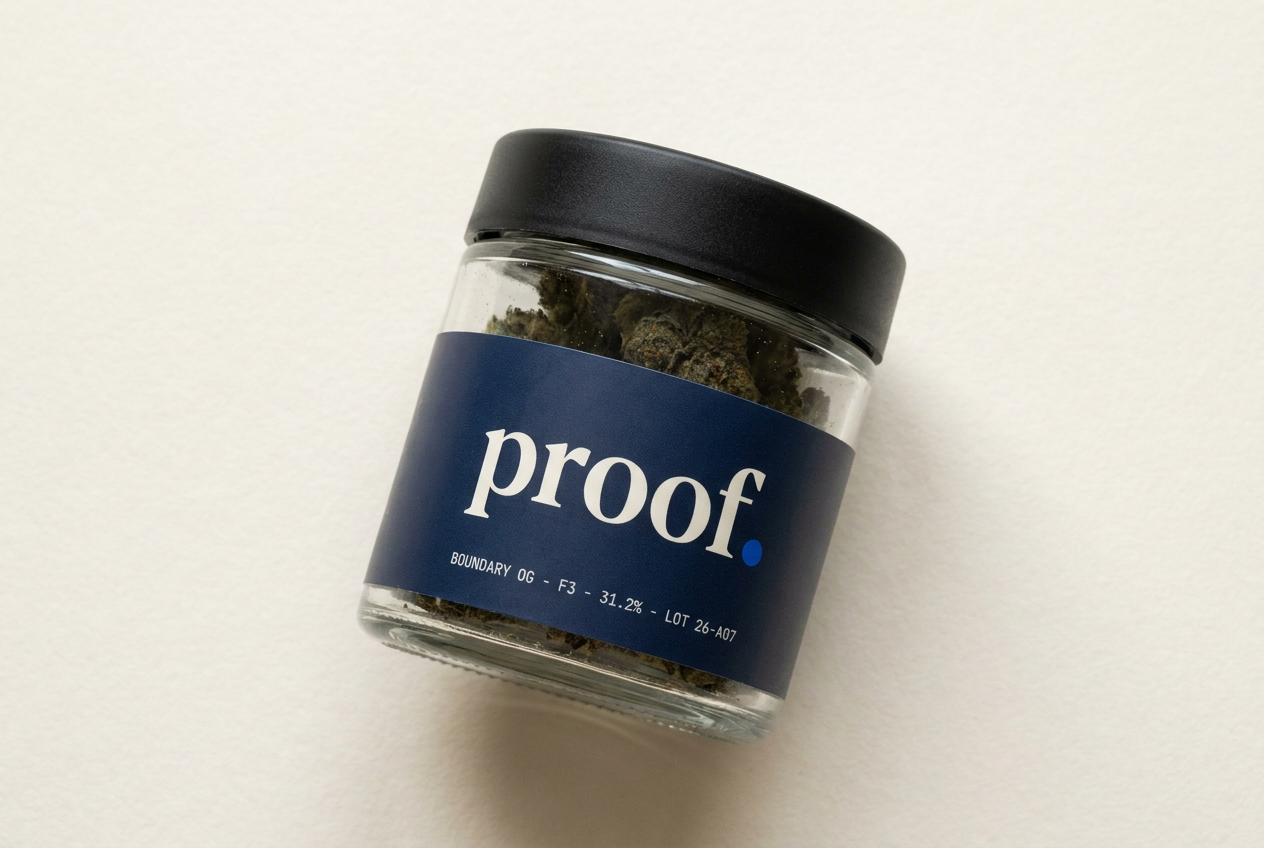
05 · Packaging system
Four formats. One grammar.
Every Proof package shares the same four-element front-panel grammar: wordmark · strain name · generation + THCa% · harvest date. Set in serif and monospace, separated by thin rules. No imagery. No marketing copy. The pack is the COA.
3.5g flower · child-resistant
7g flower · childproof lid
1g hand-rolled · single
Insert · QR to digital panel
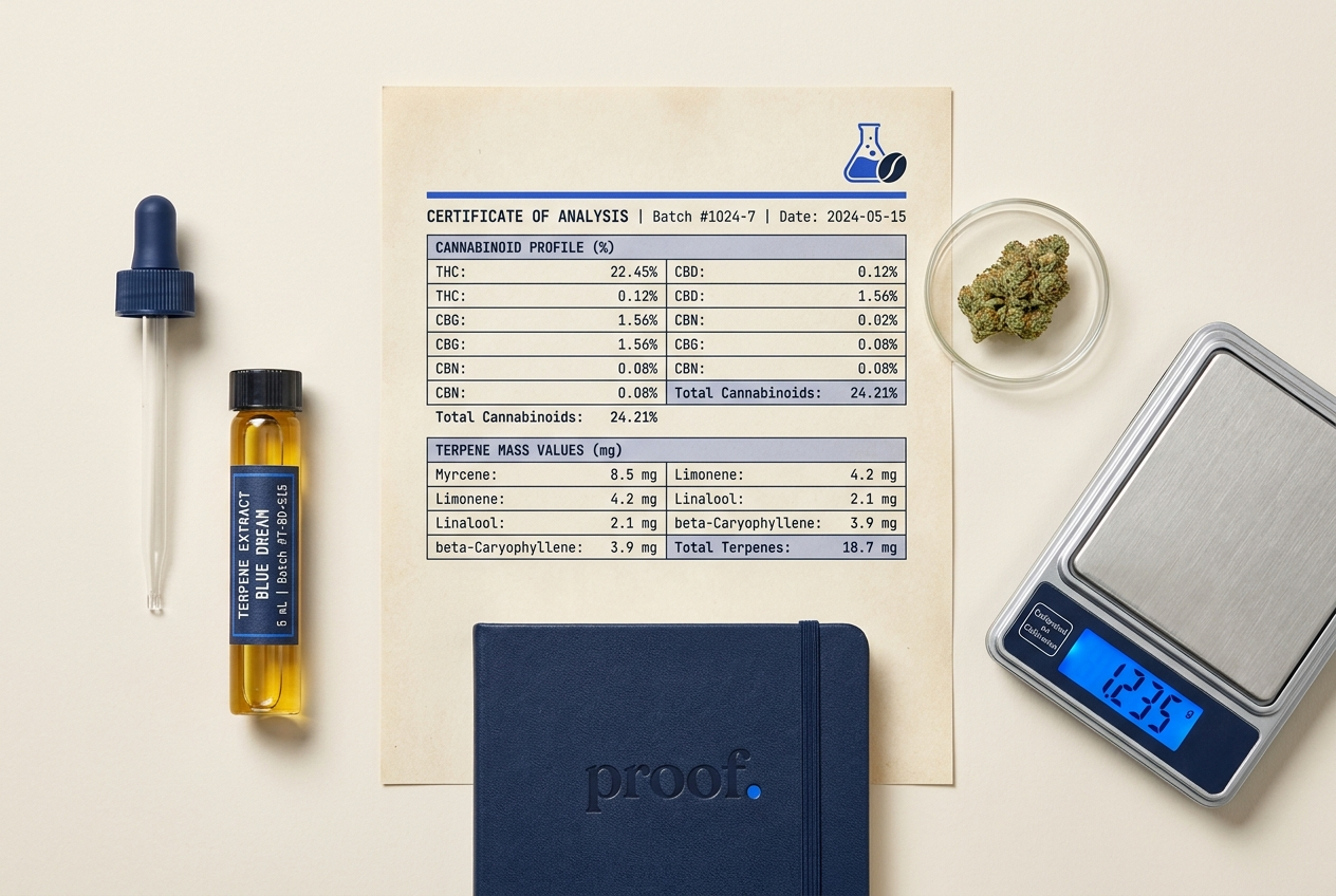
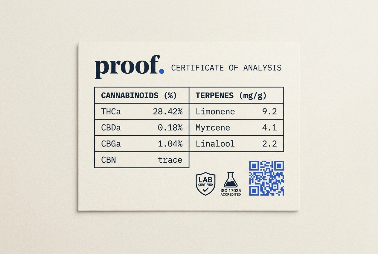
06 · The COA card
The most read piece of cannabis packaging in the buyer’s hand.
The COA card is the artifact that turns the Proof brand promise into a physical object. Inserted into every package, it carries the full cannabinoid panel, the terpene mass distribution, the cure protocol, the lot identifier, and the attestation of the two laboratories that tested the batch. A QR registration dot links to the digital version. The card is the brand — everything else exists to point at it.
What it shows
Full cannabinoid panel to two decimals. Terpene mass in mg/g for nine major terpenes. Moisture content at packaging. Cure duration in days.
What it doesn’t
No effect claims. No mood descriptors. No marketing adjectives. The card describes the batch — the buyer decides what to do with the information.
Why two labs
One lab tests for compliance. Two labs test for confidence. The buyer sees both results and trusts the lower of the two numbers as a floor — the way wine ratings work.
07 · Voice in practice
How the brand speaks.
| Surface | Proof | Not Proof |
|---|---|---|
| Pack front | Mendocino Sunset · F4 · 28.4% · 2026.03.14 | Mendocino Sunset — the most exotic flower in Oregon |
| Website hero | Documented cannabis. Bend, Oregon. Tested twice. | Discover the most premium cannabis experience |
| Email subject | Q2 harvest: three strains added, panels inside | You won’t believe what dropped this week |
| Wholesale | Proof supplies twelve Oregon retailers. We add two per quarter. Reply for the partner brief. | Excited to disrupt the cannabis category with our best-in-class genetics |
08 · Retail application
How Proof sits on a dispensary shelf.
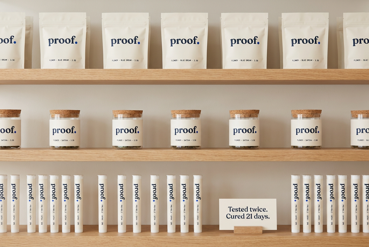
The shelf system is built for line-of-sight at distance. The warm-white packaging registers as a single coherent block in a category dominated by saturated color. The cobalt verification dot is the only chromatic note — it draws the eye from across the store. The shelf-talker card carries one sentence in serif: Tested twice. Cured 21 days.
09 · Guideline summary
The rules, on one page.
Always
- State strain, generation, THCa%, and harvest date on every pack
- Publish two third-party test results, side by side
- Set numerals in JetBrains Mono
- Set prose in Inter 300 / 400
- Reserve cobalt for verification marks only
- Use lowercase for the wordmark
- Use a single thin rule per panel, never decoration
Never
- Use cannabis-leaf iconography
- Use the words “premium,” “exotic,” or “dank” as adjectives
- Make effect claims that aren’t studied
- Style numerals with ornament
- Use gloss varnish or metallic foil
- Show founder portraits as hero
- Use exclamation marks anywhere
Closing
Proof is a brand designed to earn its name on every package. The system above is not a creative exercise. It is a contract with the careful buyer.