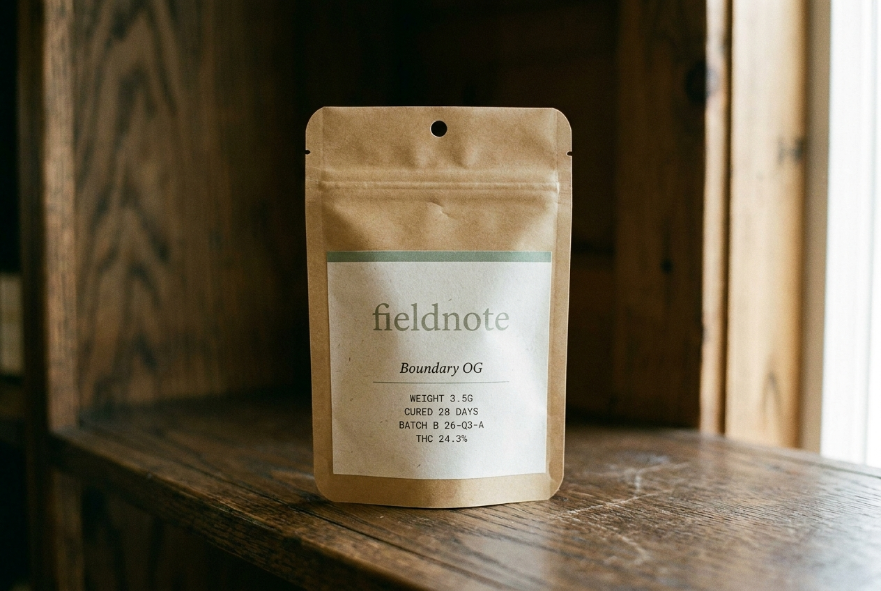
Fieldnote
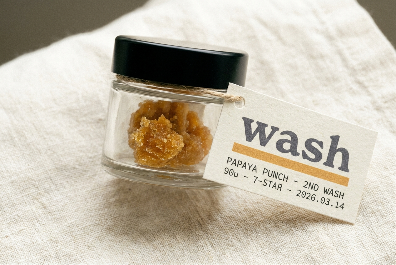
Wash
Positioning
A journal-like cannabis brand built around place, season, and hospitality. The cannabis brand a state park gift shop would carry. Paper bone, ink, sage accent — four seasonal rotations a year.
A process-led Humboldt hash lab that documents every lot with the rigor of a third-wave coffee roaster release note.
Audience
Adult-use consumers who buy with intention. The kind of customer who reads field guides on vacation.
Concentrate buyers who treat hash like single-origin espresso, plus careful combustion reducers curious about concentrates.
Voice
Journal-like, place-specific, hospitality-focused. Documentary not decorative. Editorial serif headlines + clean sans body + monospace utility.
Technical, specific, and calm. Specialty coffee release card meets craft distillery production log.
Style
Paper bone + warm-black ink + sage (cured-cannabis) accent. Four seasonal accent rotations per year (winter pine, spring bud, summer wheat, autumn ember).
Ice-paper substrate, deep grey ink, silver industrial accents, warm amber rule, IBM Plex technical typography.
Avoids
Green-on-black, two accents on one surface, generic startup voice, decorative branding
Dabber lifestyle, neon hype, founder-cult hashmaker mythology, solvent-based cues, superlative claims
Market
Minnesota, Multi-state US
California
Category
Flower, Pre-rolls, Edibles, Concentrates
Concentrates, Extraction
Model
Brand only, DTC
Brand only, B2B / Wholesale
Aesthetic
Seasonal / journal, Editorial
Technical, Editorial