Fieldnote
Brick
Posicionamiento
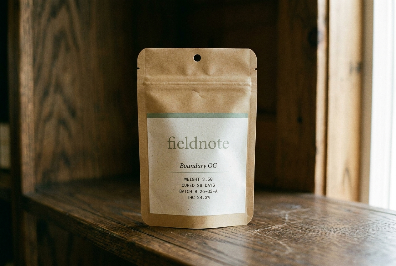
A journal-like cannabis brand built around place, season, and hospitality. The cannabis brand a state park gift shop would carry. Paper bone, ink, sage accent — four seasonal rotations a year.
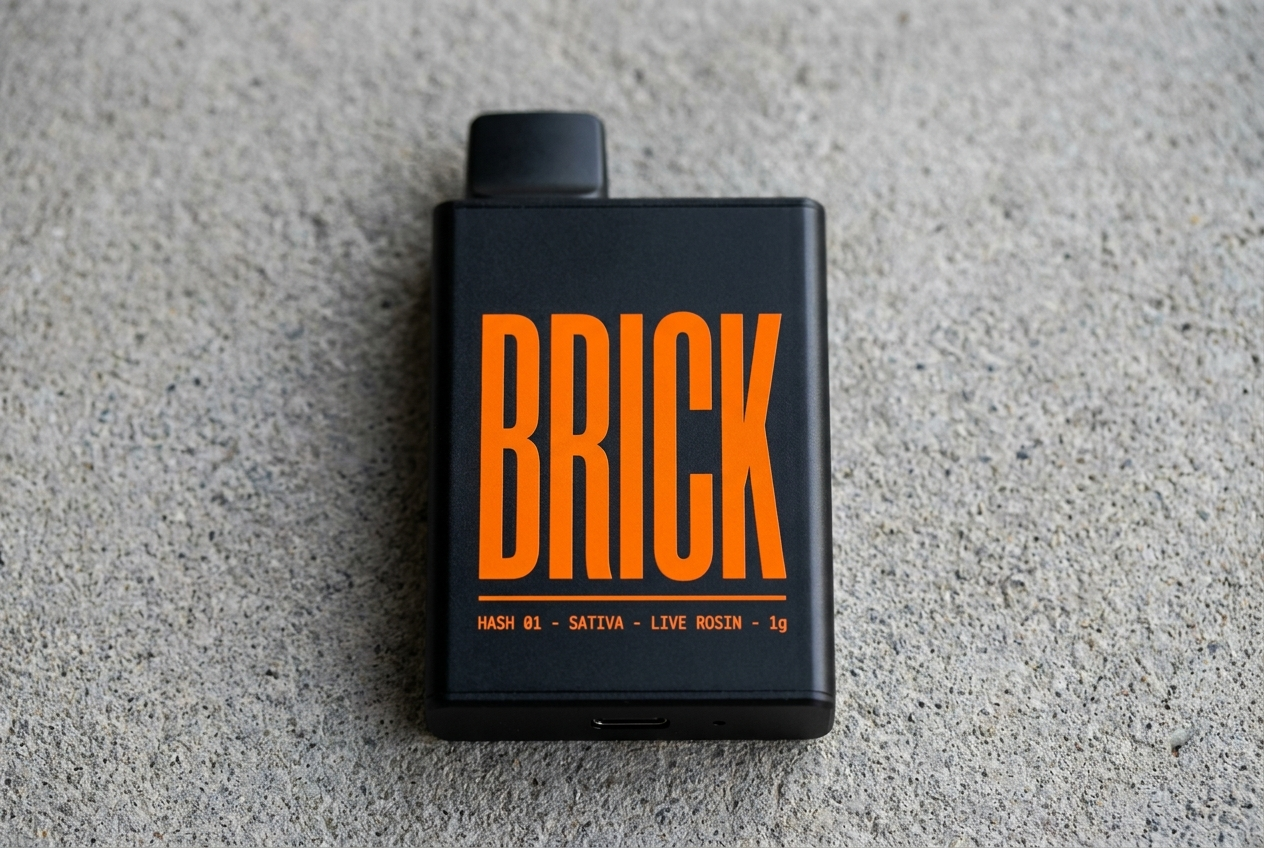
A live-rosin hash disposable for the urban buyer who already knows what is inside and wants something they can actually carry.
Audiencia
Adult-use consumers who buy with intention. The kind of customer who reads field guides on vacation.
Urban hash buyers, 24-38, who already know the difference between distillate and live rosin and do not want to baby the product.
Voz
Journal-like, place-specific, hospitality-focused. Documentary not decorative. Editorial serif headlines + clean sans body + monospace utility.
Blunt, declarative, and low on adjectives. Off-White care card meets Carhartt WIP catalog spec line meets subway notice.
Estilo
Paper bone + warm-black ink + sage (cured-cannabis) accent. Four seasonal accent rotations per year (winter pine, spring bud, summer wheat, autumn ember).
Matte black, safety orange, concrete grey, caution-stripe texture, condensed caps, monospace product specs.
Evita
Green-on-black, two accents on one surface, generic startup voice, decorative branding
Heady-glass collector culture, distillate commodity cues, soft wellness language, decorative premium minimalism
Mercado
Minnesota, Multi-state US
California, Multi-state US
Categoria
Flower, Pre-rolls, Edibles, Concentrates
Vapes, Concentrates
Modelo
Brand only, DTC
Drop model, DTC, Brand only
Estetica
Seasonal / journal, Editorial
Street-bold, Technical