Fieldnote
Counter
Posicionamiento
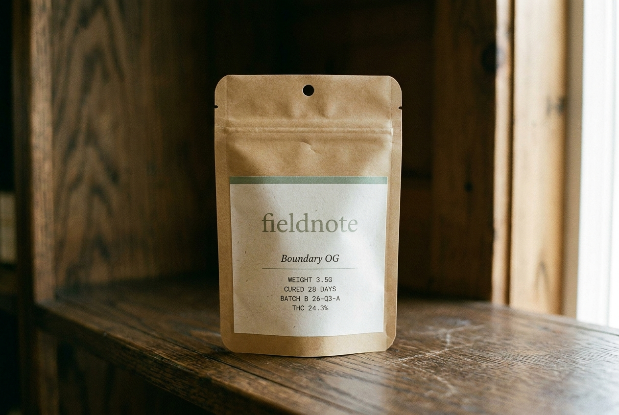
A journal-like cannabis brand built around place, season, and hospitality. The cannabis brand a state park gift shop would carry. Paper bone, ink, sage accent — four seasonal rotations a year.
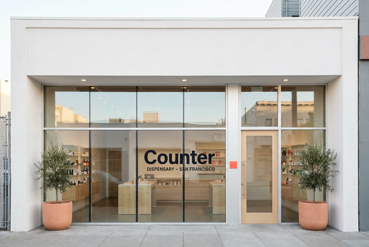
A private-label San Francisco dispensary chain using the modern flagship retail playbook: glass, light wood, iPads, no cash wrap.
Audiencia
Adult-use consumers who buy with intention. The kind of customer who reads field guides on vacation.
Premium San Francisco buyers who already shop Apple, Aesop, Mejuri, Sweetgreen, and expect cannabis retail to match the rest of their week.
Voz
Journal-like, place-specific, hospitality-focused. Documentary not decorative. Editorial serif headlines + clean sans body + monospace utility.
Quiet, premium, modernist, and product-led. Short retail-system copy, not lifestyle cannabis copy.
Estilo
Paper bone + warm-black ink + sage (cured-cannabis) accent. Four seasonal accent rotations per year (winter pine, spring bud, summer wheat, autumn ember).
Clean white surface, deep ink, electric coral accent, maple architecture, Manrope display type, product edition grammar.
Evita
Green-on-black, two accents on one surface, generic startup voice, decorative branding
Legacy glass-case dispensary format, cash-wrap checkout, third-party shelf chaos, streetwear cannabis cues
Mercado
Minnesota, Multi-state US
California
Categoria
Flower, Pre-rolls, Edibles, Concentrates
Retail, Flower, Concentrates, Pre-rolls, Edibles
Modelo
Brand only, DTC
Dispensary, Retail chain, DTC
Estetica
Seasonal / journal, Editorial
Premium retail, Editorial