Brick
Counter
Posicionamiento
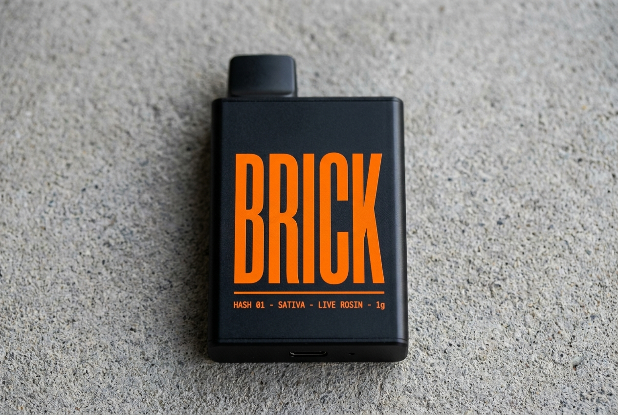
A live-rosin hash disposable for the urban buyer who already knows what is inside and wants something they can actually carry.
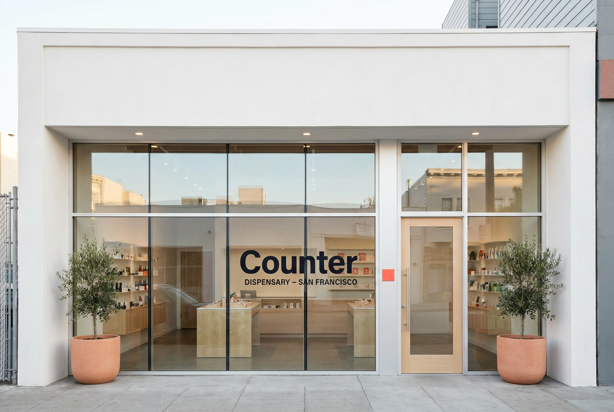
A private-label San Francisco dispensary chain using the modern flagship retail playbook: glass, light wood, iPads, no cash wrap.
Audiencia
Urban hash buyers, 24-38, who already know the difference between distillate and live rosin and do not want to baby the product.
Premium San Francisco buyers who already shop Apple, Aesop, Mejuri, Sweetgreen, and expect cannabis retail to match the rest of their week.
Voz
Blunt, declarative, and low on adjectives. Off-White care card meets Carhartt WIP catalog spec line meets subway notice.
Quiet, premium, modernist, and product-led. Short retail-system copy, not lifestyle cannabis copy.
Estilo
Matte black, safety orange, concrete grey, caution-stripe texture, condensed caps, monospace product specs.
Clean white surface, deep ink, electric coral accent, maple architecture, Manrope display type, product edition grammar.
Evita
Heady-glass collector culture, distillate commodity cues, soft wellness language, decorative premium minimalism
Legacy glass-case dispensary format, cash-wrap checkout, third-party shelf chaos, streetwear cannabis cues
Mercado
California, Multi-state US
California
Categoria
Vapes, Concentrates
Retail, Flower, Concentrates, Pre-rolls, Edibles
Modelo
Drop model, DTC, Brand only
Dispensary, Retail chain, DTC
Estetica
Street-bold, Technical
Premium retail, Editorial