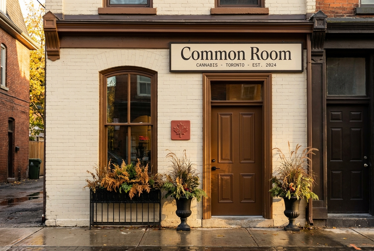
Common Room
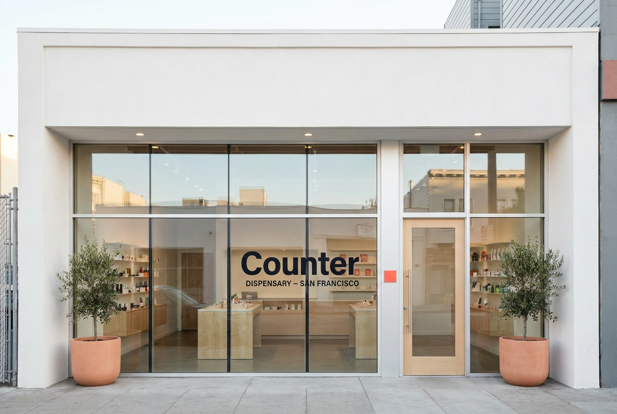
Counter
Positioning
A warm Toronto cannabis room with craft cultivators, knowledgeable staff, and a retail rhythm built around relationship, not checkout speed.
A private-label San Francisco dispensary chain using the modern flagship retail playbook: glass, light wood, iPads, no cash wrap.
Audience
Toronto residents who treat a wine merchant, bookstore, or specialty retailer as part of their weekly rhythm.
Premium San Francisco buyers who already shop Apple, Aesop, Mejuri, Sweetgreen, and expect cannabis retail to match the rest of their week.
Voice
Warm, specific, and never pushy. Specialty wine merchant newsletter meets staff-pick shelf-talker meets polite hotel concierge note.
Quiet, premium, modernist, and product-led. Short retail-system copy, not lifestyle cannabis copy.
Style
Oat cream, deep ink, maple brown, soft red accent, Cormorant editorial type, cream cotton print artifacts.
Clean white surface, deep ink, electric coral accent, maple architecture, Manrope display type, product edition grammar.
Avoids
Discount cannabis retail, fluorescent chain-store energy, transaction-time optimization, glossy premium minimalism
Legacy glass-case dispensary format, cash-wrap checkout, third-party shelf chaos, streetwear cannabis cues
Category
Retail, Flower, Concentrates, Pre-rolls
Retail, Flower, Concentrates, Pre-rolls, Edibles
Model
Dispensary
Dispensary, Retail chain, DTC
Aesthetic
Intimate / hospitality, Heritage, Premium retail
Premium retail, Editorial